Shaping my story [creation of an artist’s book]

It is difficult for designers to find the opportunity to work on a personal project where various disciplines interact, but above all where we expose emotional aspects of personal experiences.

Table of Contents

This experimental book is the result of six months of production under the direction of Brody Neuenschwander in a course called “Shaping your Story”. Although it is a personal job, I shared this experience with an incredible group of designers and artists from which inspiration and mutual accompaniment emerged. Since I started studying graphic design, I always had a special fascination with letters, first for typography, then for calligraphy and lettering. In recent years I have been orienting my training towards the visual arts where all these interests coexist. Telling my process in this article is motivating because it forces me to think and organize a journey that at times was quite messy and even chaotic. I think the most practical and didactic way to be able to approach it is to divide it into stages.

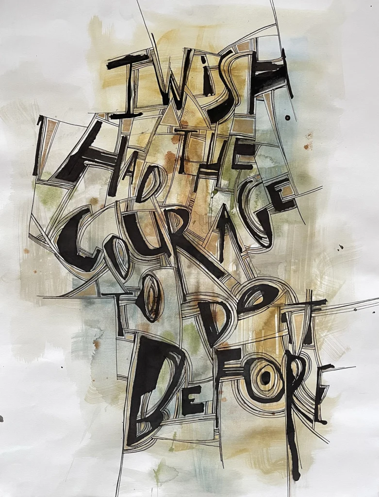
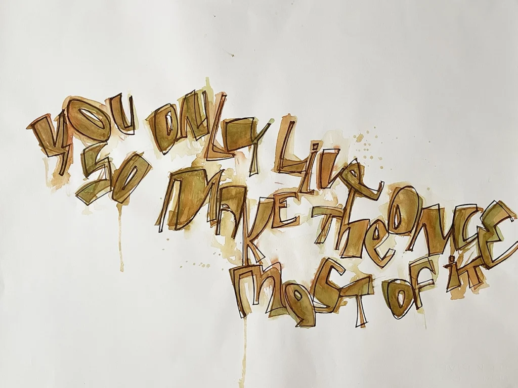
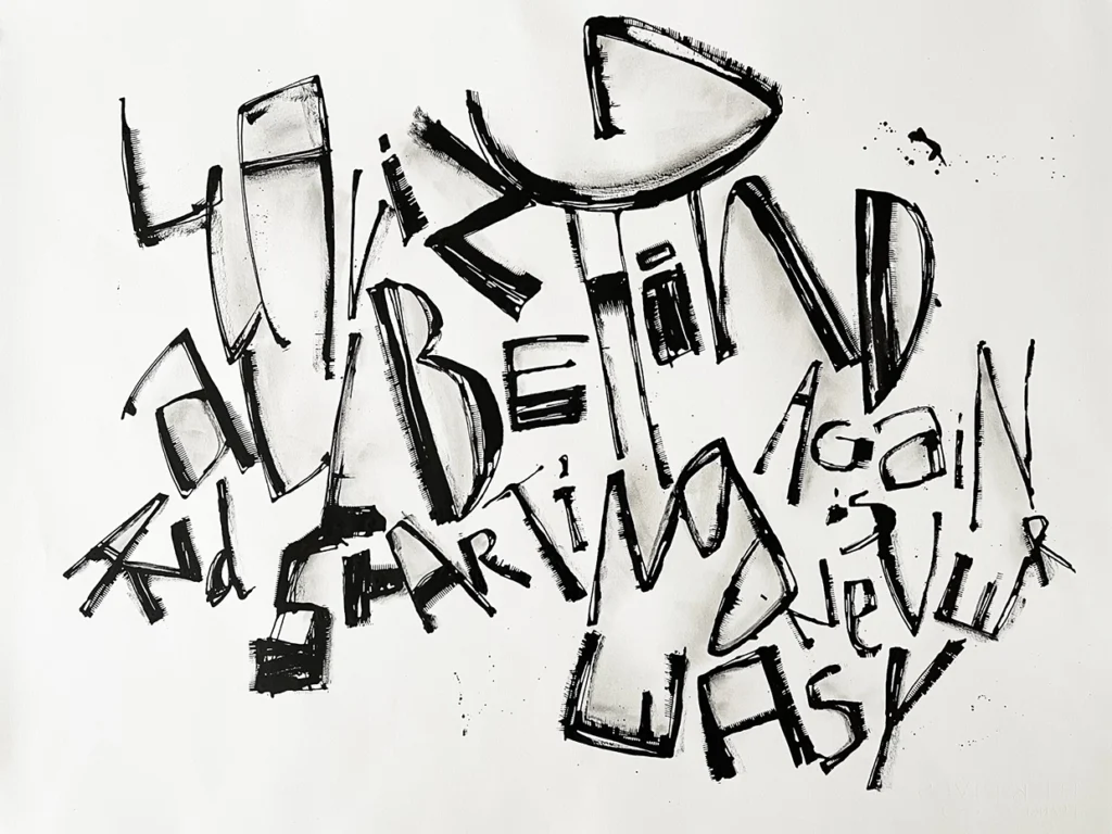
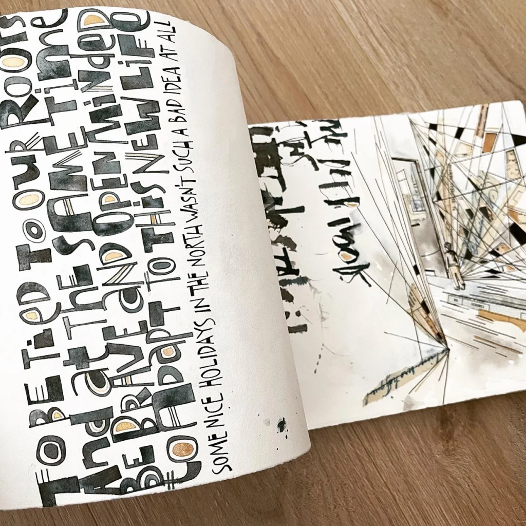
Stage1- Construction of the text/Materials

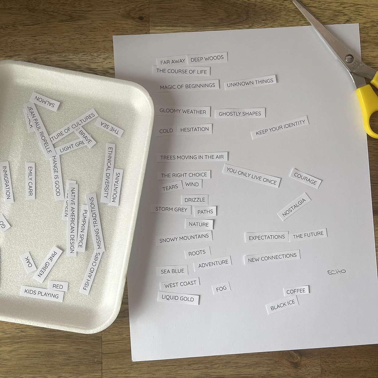
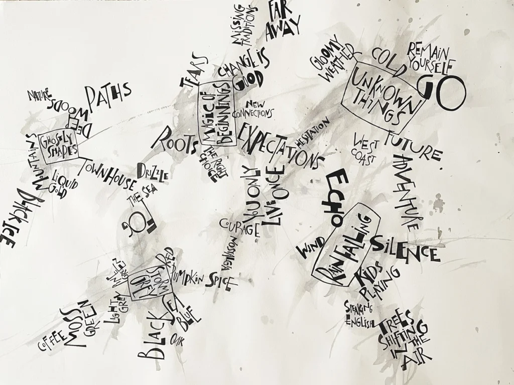
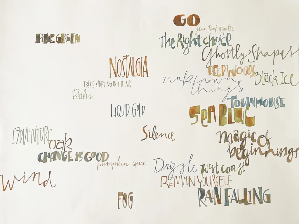
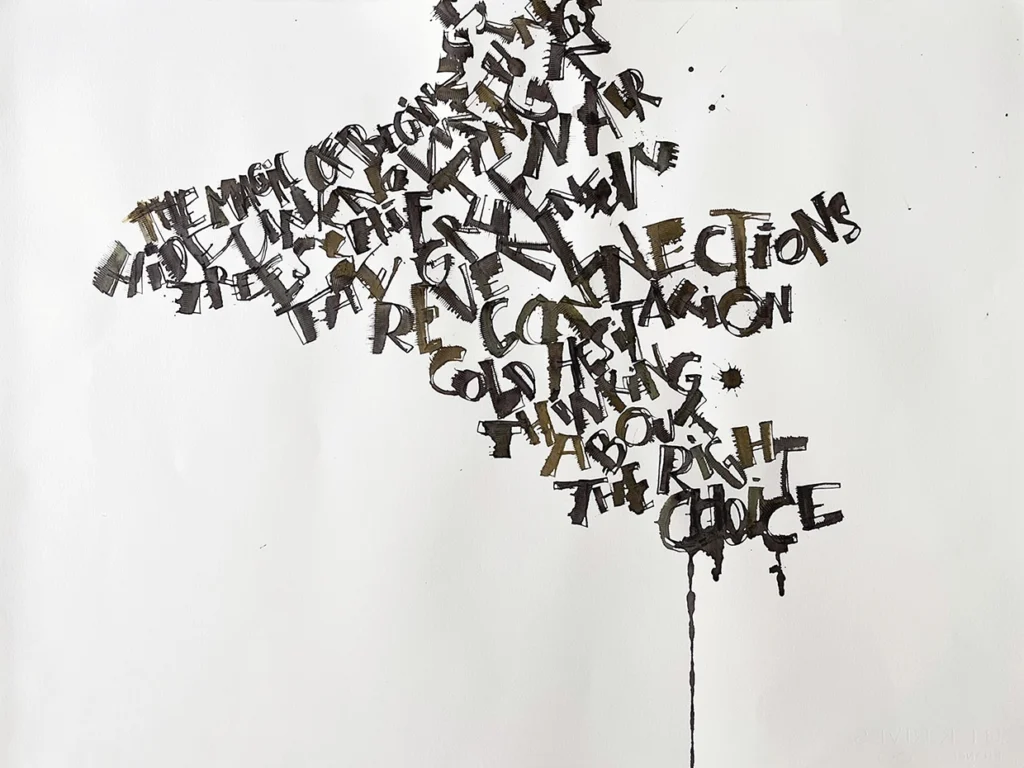
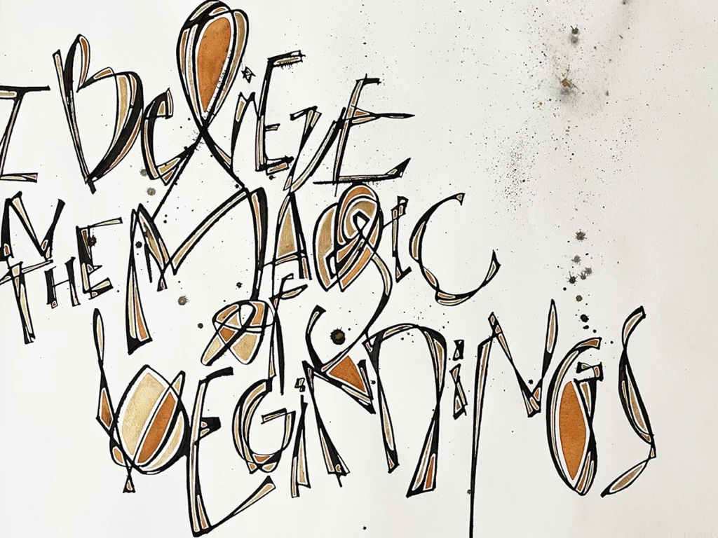
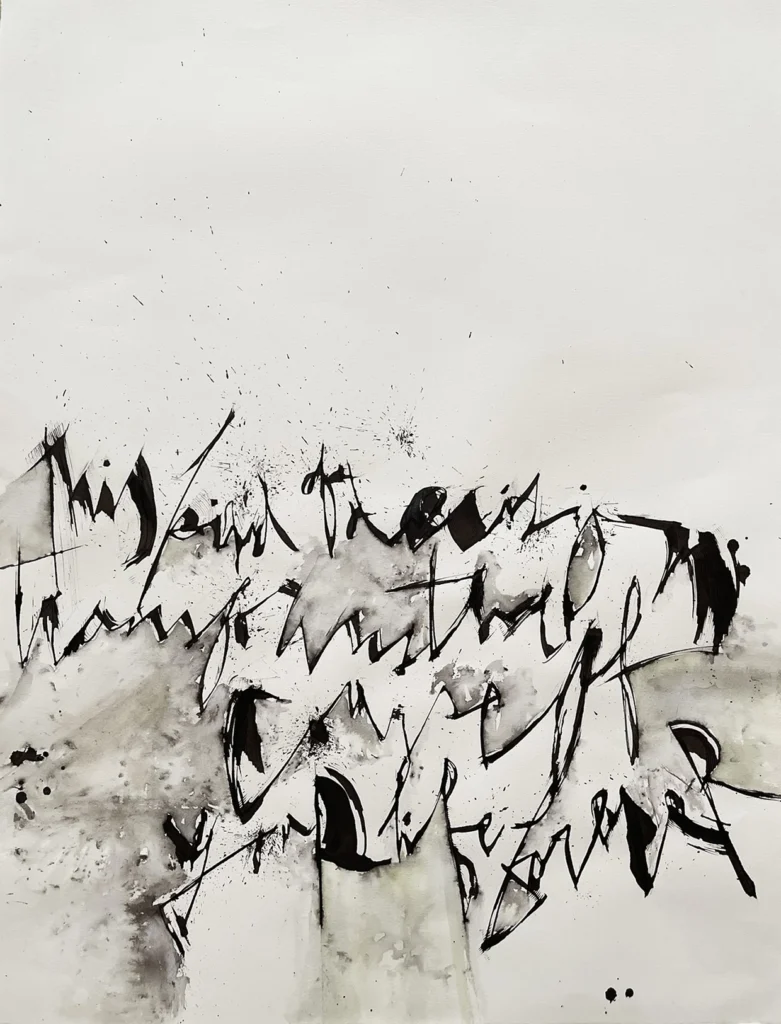
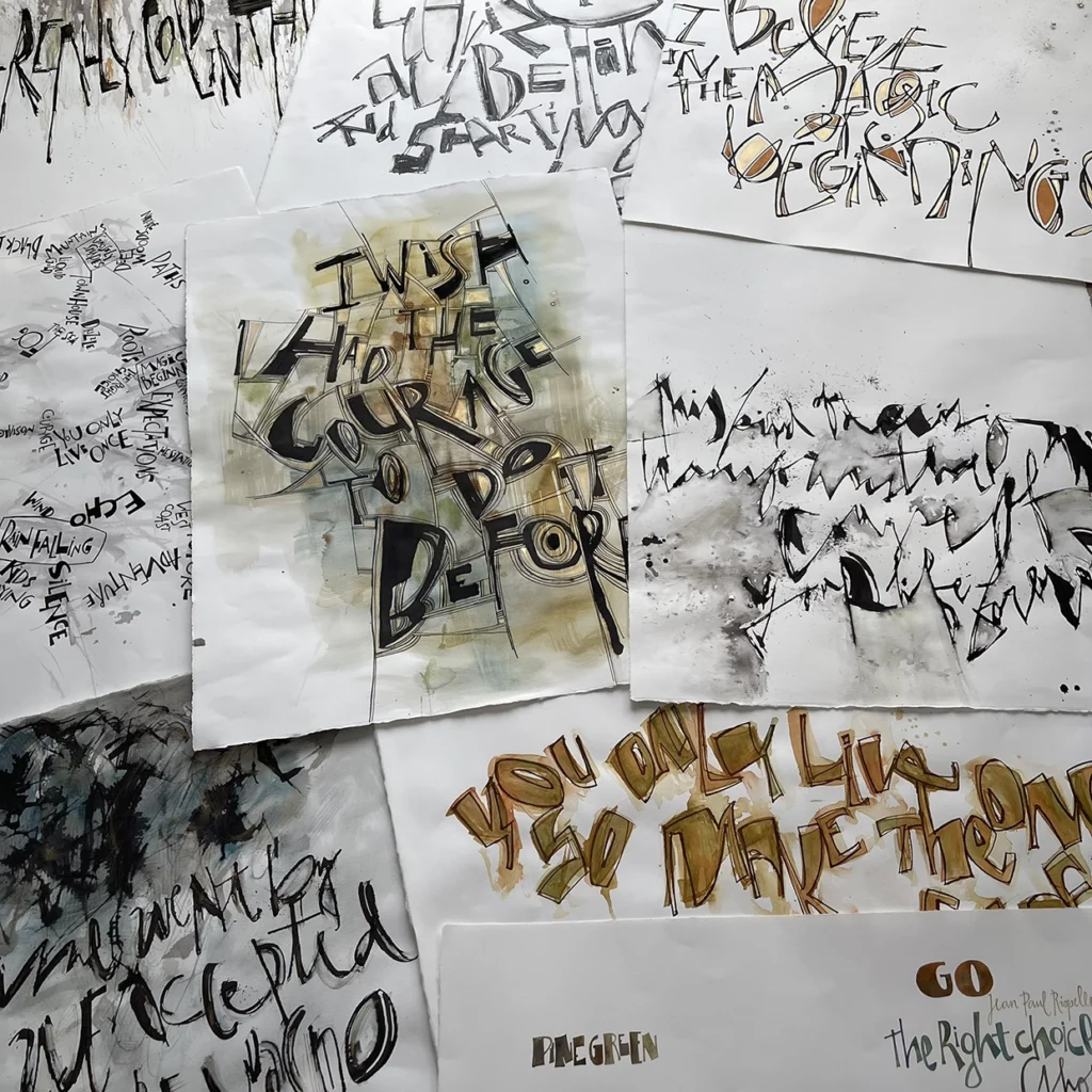
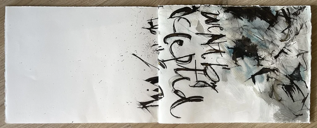
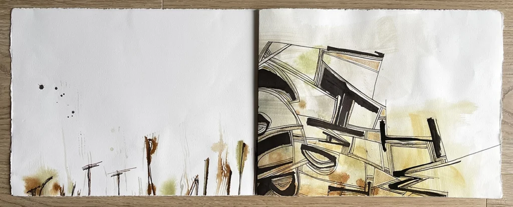
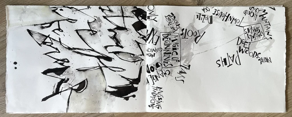
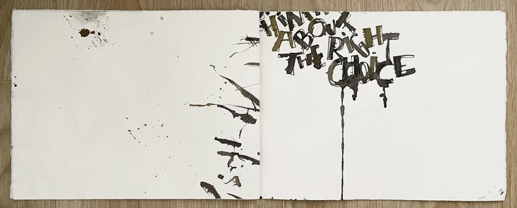
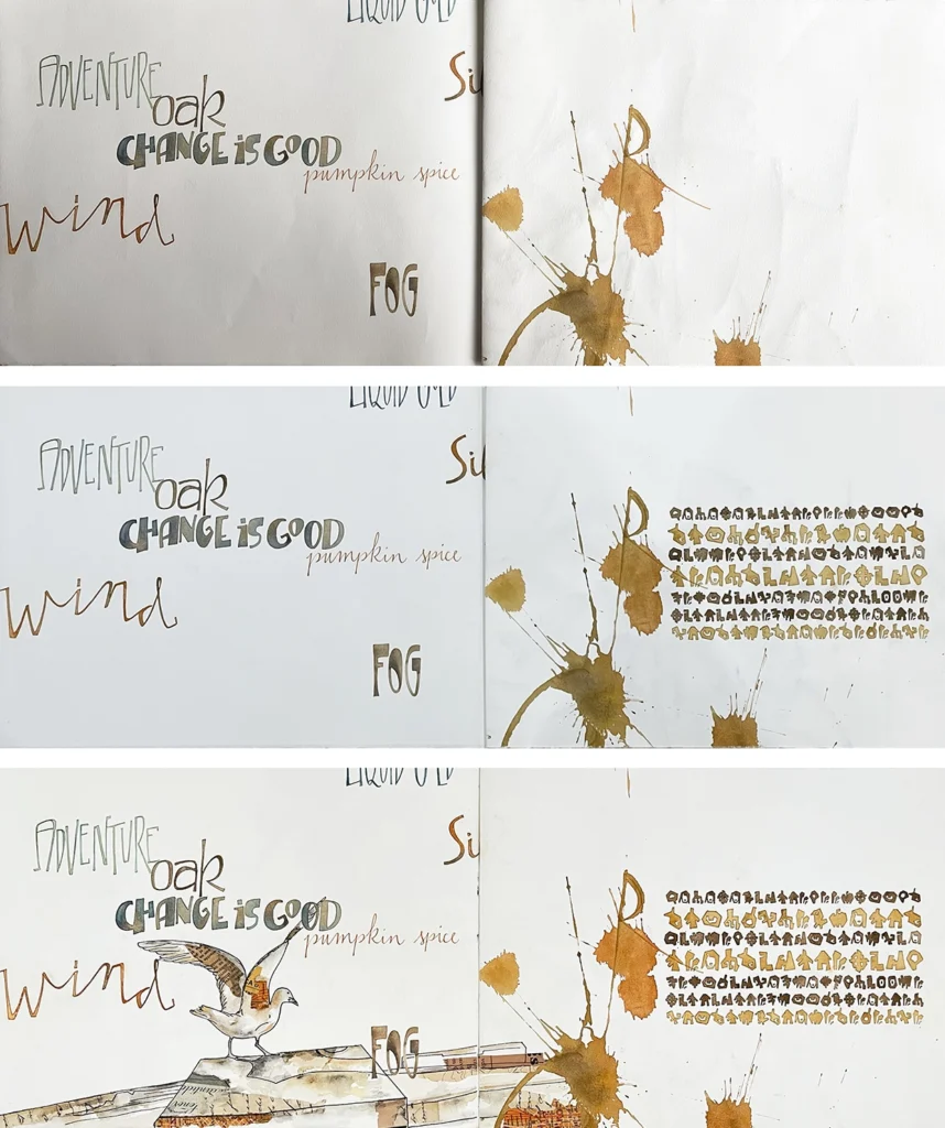
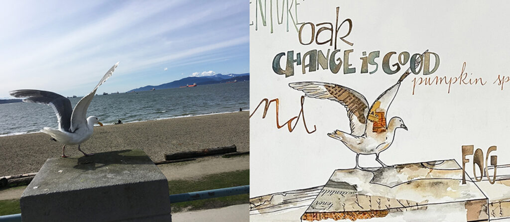
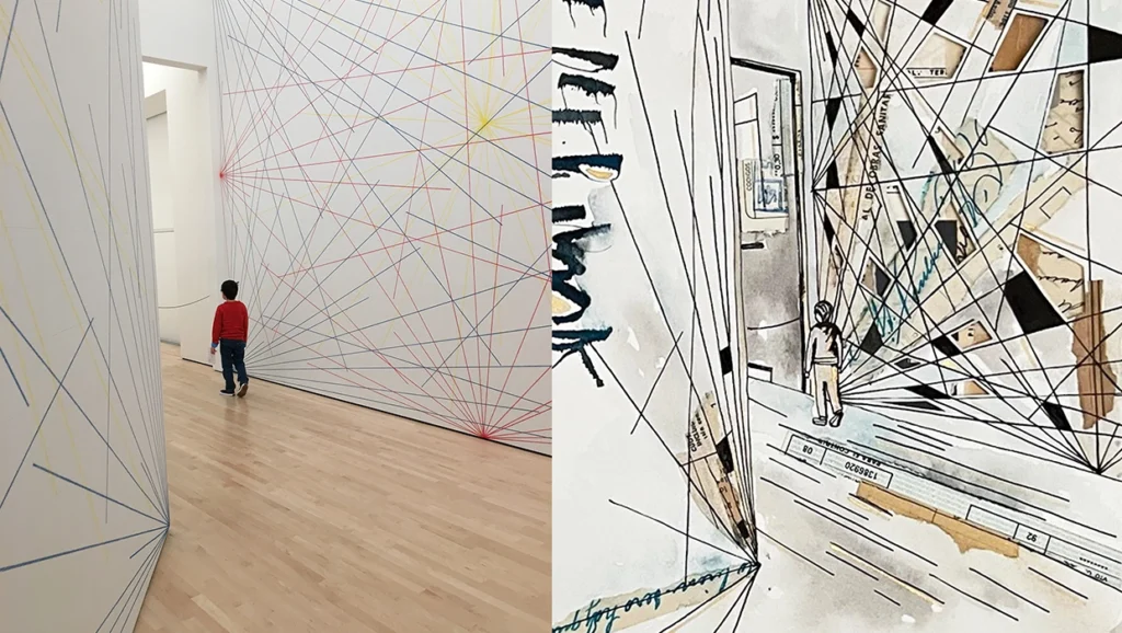
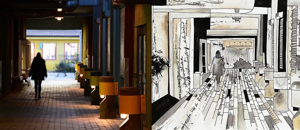
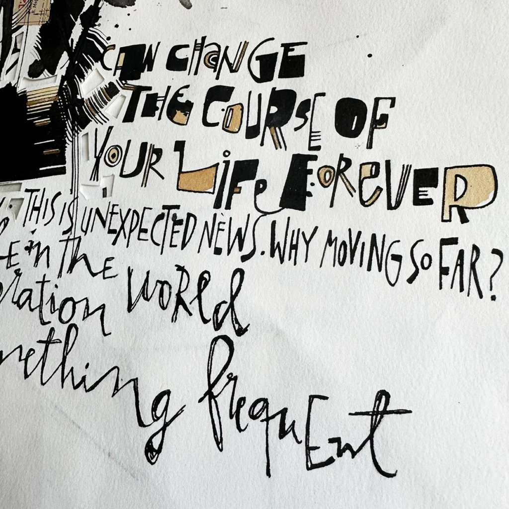
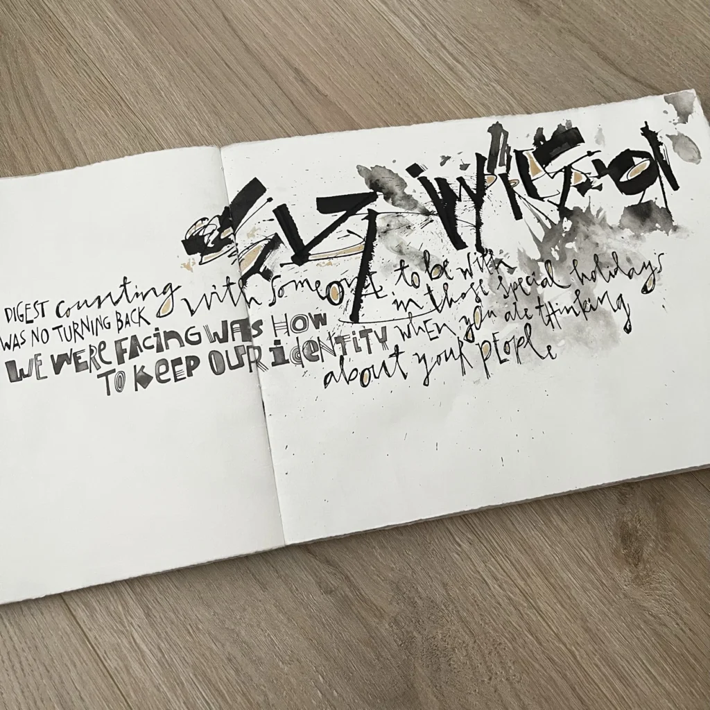
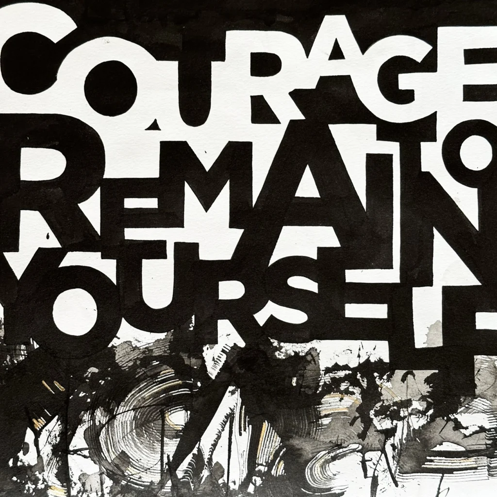
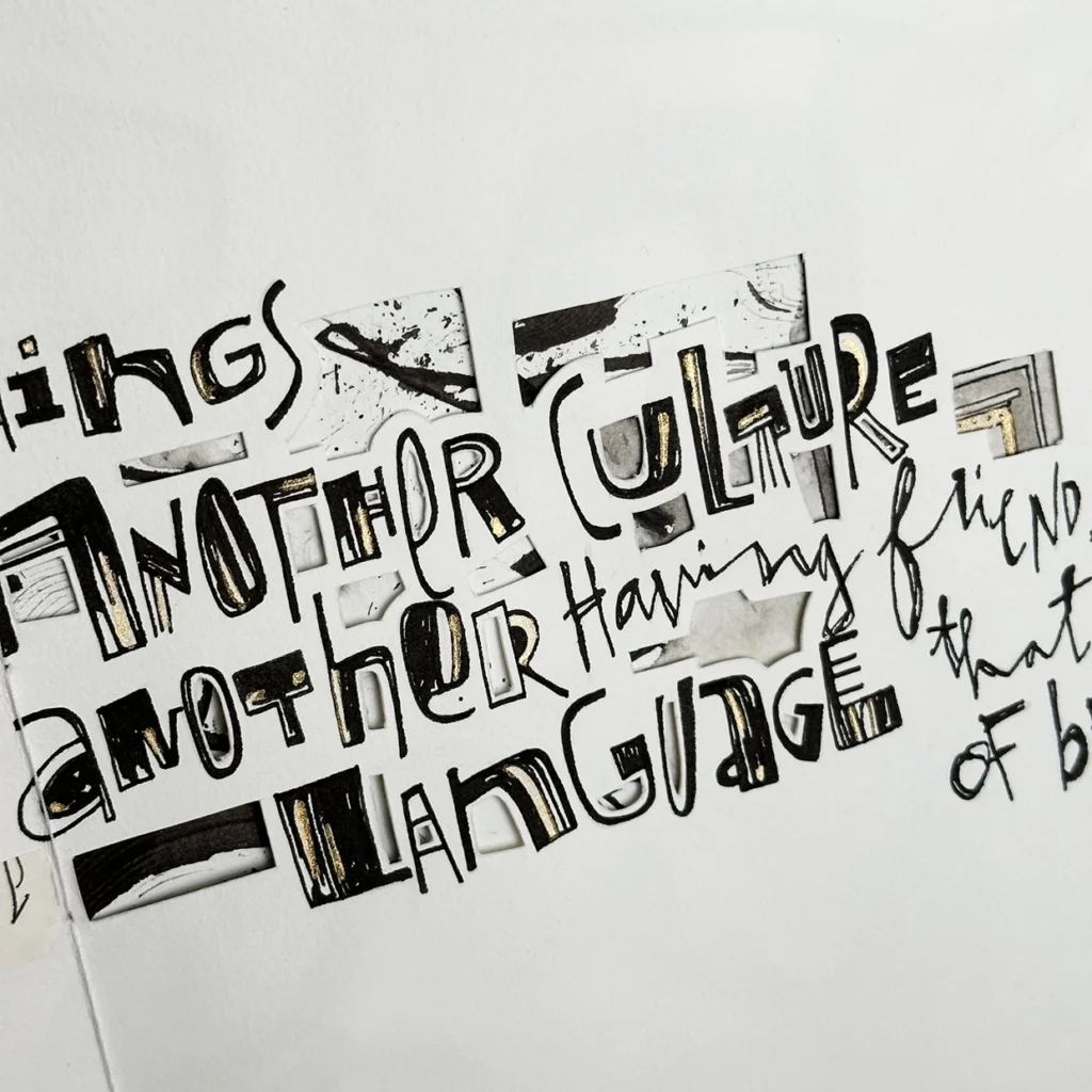
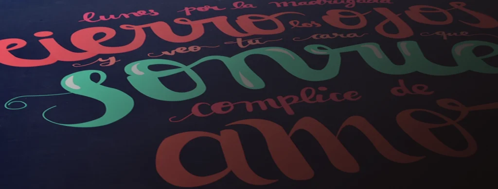
For those of us who work with letters, the big question turns out to always be what to write. When we face a design project, this does not usually present major complications because the responsibility for the text lies, in most cases, with the client. But, unlike graphic design, in art it is of great value to work from the subjective. With the criteria of thinking of an experience that would help me build this artist’s book, I wrote a text that recounts my move from Argentina to Canada. A very mobilizing personal stage, full of obstacles, challenges and discoveries. At no time in the process was it necessary to expose the text to be read by the other participants, but it simply served as an excuse for the development of phrases, ideas, words, and lists of associations referring to sounds, colors and climates. Literary quality was also not of great importance, it was about writing my thoughts and feelings in a simple way and with the possibility that the text could be mutated or edited at any time of the process. 
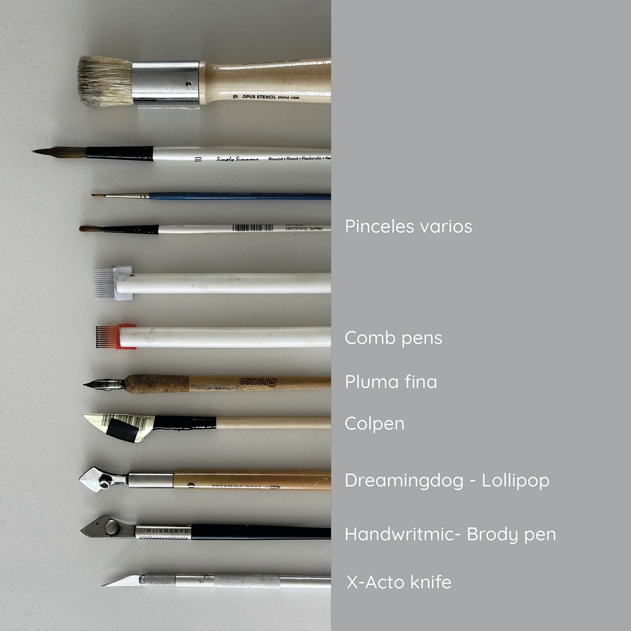
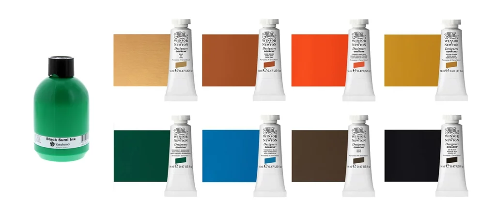
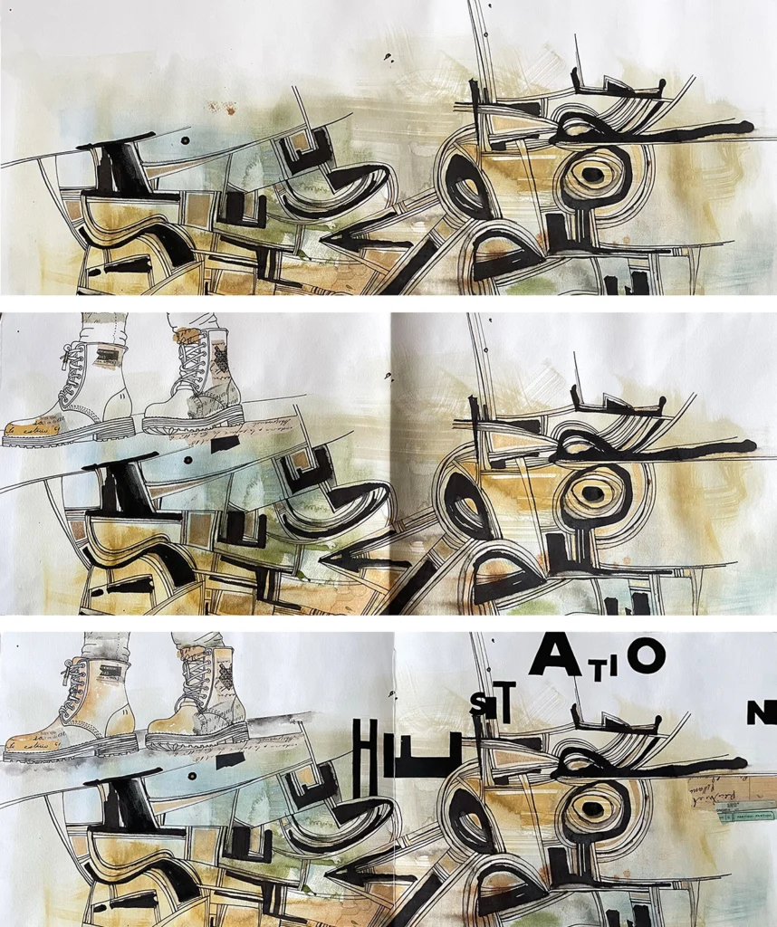
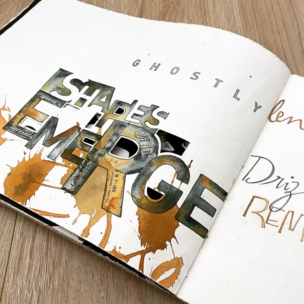
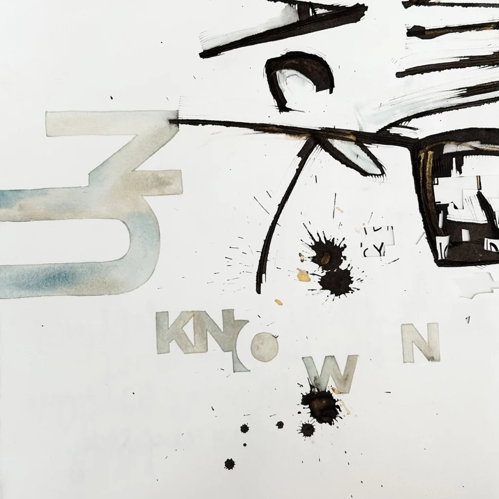
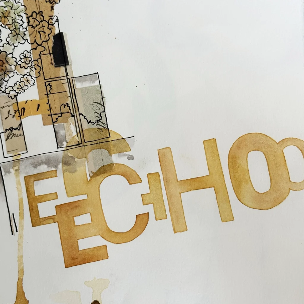
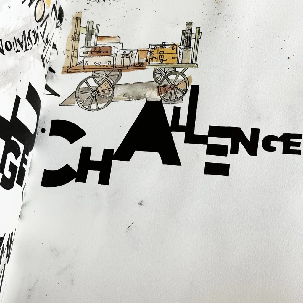
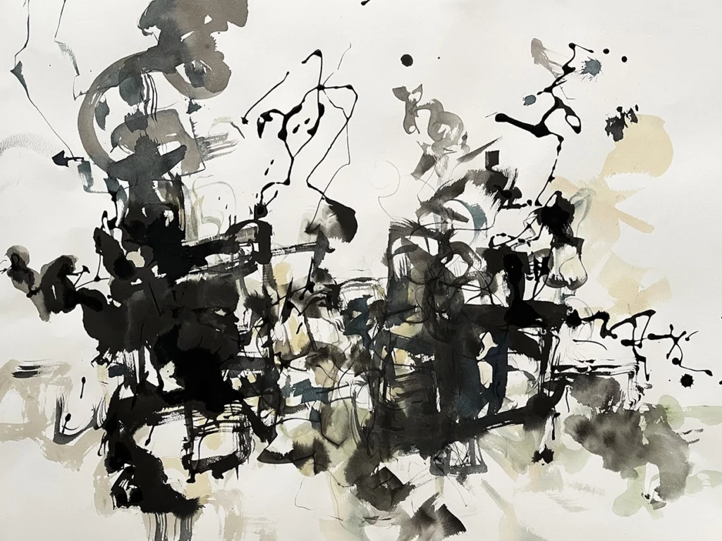
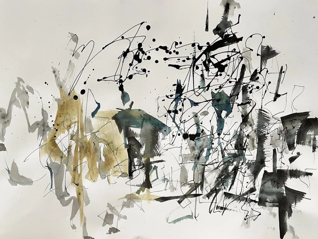
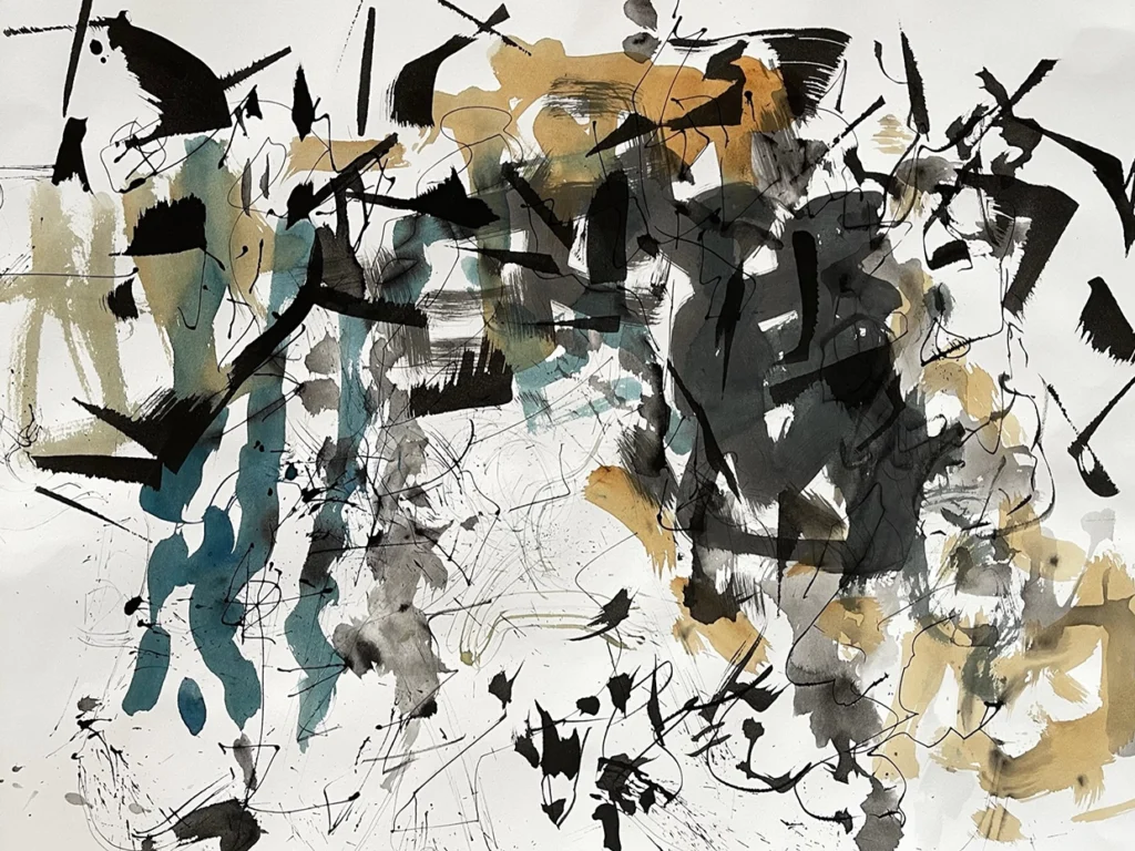
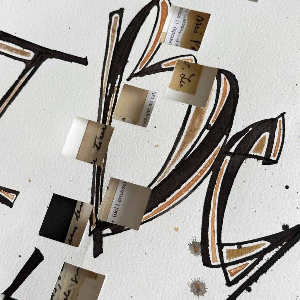
With the information already underway, I was able to start analyzing what media and tools would allow me to generate a great visual variety in such a complex job. I chose different thin and thick ruling pens, colapen, brushes of different sizes, comb pen2, fine pen, gouache and sumi ink.
Shaping my history
Words
Shaping my history
Tools
Shaping my history
Chromatic palete

Stage2- The approach of the blank page

Starting from the analysis of the text and several decisions made previously, I worked on some layouts (approximately 50x70cm) with diagrams of words and with phrases created from different styles of expressive calligraphy.

Shaping my history
Word association
Shaping my history
Free written words and phrases
Shaping my history
Composition
Shaping my history
Shaping my history
Shaping my history
Shaping my history
Shaping my history
Shaping my history

Stage 3- The double page

By cutting these initial sheets in half, horizontally, I generated the first possible double-page combinations. In this first instance, many of the pages were still empty or with few elements but they already had some idea of basic structure to work in the future in a more complex way. It is important to keep in mind that cutting the sheets in half generated new compositions that in many cases were more interesting than the original ones.

Shaping my history
Shaping my history

Stage 4- Complexity of the content

This instance was the true core of the work, the moment at which most of the decisions that constituted the language and order of the pages were made. The dosage and combination of elements was key to achieve rhythm and unity.

Illustration

From my own photographs I worked generating drawings in ink that I then combined with the existing structures or used on pages that were still blank. All the images correspond to moments and places traveled that I have been recording since my arrival in Canada. The child who appears in several of the illustrations is my son, so these personal records were an emotional contribution that served as a trigger and a common thread. Later I used collage as a visual resource with old family papers that added more detail to the construction of the images.

Drawn Letters

In the book there are different types of drawn letters, some of the “wrong letters” 3 style and others that refer to gestural calligraphy. Usually, this process involves drawing the edge with a fine pen and then making the filling with a brush of the measure that is necessary according to the size of the signs.

In another instance of the work, the letter drawing was based on the observation of typographic families (in my case Gotham and Din). The goal was to incorporate simple style shapes that contrasted with the expressive strokes generated with the tools in the previous compositions.

In another instance of the work, the letter drawing was based on the observation of typographic families (in my case Gotham and Din). The goal was to incorporate simple style shapes that contrasted with the expressive strokes generated with the tools in the previous compositions.

Drawing with eyes closed

In one of the most interesting exercises that are part of this book, I worked with the help of an assistant on a series of drawings with my eyes closed. While imagining a moment of the story, the other person with total freedom was providing me with tools already loaded with the colors of the palette while directing where on the page I would begin to make the strokes. The result of this experience was a series of completely random compositions.

Installation

In the hypothetical case of making an installation that amplified the idea of the project and that could be presented to a wide audience, I made an interactive proposal based on the concept of distance. Participants (immigrants or their descendants who arrived in Canada since the beginning of the 20th century) would enter data associated with their places of origin and these would be projected inside a dome generating typographic patterns in space.

Stage 5- Assembly and final finishes

Following all criteria from previous stages I established the final order of the pages, discarding some and adding other elements where I considered necessary. I decided to add small cut out shapes and details in gold ink. The pages were finally combined into booklets and handsaw together.

At times, so much freedom and free will in this project were overwhelming since the possibilities were infinite but I let flow what was emerging as an expression at the time from the exercises proposed and also trying that my criteria as a designer did not limit experimentation.

The objective of this story is not only to unravel a creative process but also to motivate about the importance of concluding a complex work where doubts are constant and mistakes often become solutions.

Brody Neuenschwander is an American calligrapher and artist who currently resides in Bruges, Belgium. His vast experimentation ranges from formal to expressive calligraphy covering a wide range of supports from canvas to textiles, glass and metal.

He is a teacher with a profound experience and has given workshops around the world.
Brody Neuenschwande website

Andrea Roman is a Graphic Designer graduated from FADU, University of Buenos Aires. She was a professor of Typography and Morphology for 13 years in the same faculty and also worked as a teacher for 9 years in another tertiary institution, Escuela Da Vinci, teaching different subjects associated with typography, talks and workshops in the graphic design career. She worked as a designer in Alejandra Carbone’s studio and as a freelancer, developing various identity systems.

She began her calligraphic training in Argentina with Silvia Cordero Vega and continues to specialize with other great masters such as Brody Neuenschwander, Yves Leterme, Yukimi Annand and Amity Parks. She currently lives in Vancouver, Canada.

Follow Andrea on her networks