BY ALEJANDRA CARBONE
At what point did the letter stop being a neutral vehicle for the meaning of a text to begin to function as a visual appeal?
To find a possible answer, we are going to focus on a paradigmatic graphic piece: the poster. We know that the modern typographic poster was born during the industrial revolution and developed from the audacity of those who began to conceive letters with exaggerated features and increasingly larger.
Table of Contents
The expressive lettering
This is what Robert Massin calls alphabetic signs that convey meaning not only through reading but also through their form. They are those that give up the rules of typesetting in order to reinforce meanings.
In the tradition of the book, the typography had to be uniform and transparent in order to ensure maximum readability. “The letter is the vehicle for printed communication. Drowned in words, carried away by the flow of reading on the pages, touched by the gaze of eager and avid readers, its essential mission is to make herself itself noticed as little as possible. Perceptible, but remaining invisible, mute, but with a mental projection of the speech, the letter has no more thickness on the paper than that of the ink. “ (Massin, 1970).
But the letter can be much more than a neutral vehicle for text meaning and can act as a visual appeal. “The liberation of the letter, desired by Marinetti or by concrete poets, begins at the beginning of its childhood and already appears in medieval scrolls.” (Massin, 1970).
Let’s see a bit of history
Massin speaks of a drive for expressiveness in the letters from the beginning of the writing itself, but we are going to focus on a hinge period that began with the industrial revolution. The rupture initiated by Didot and Bodoni contributed to triggering a veritable emergence of display typography in the 19th century. Technological innovations were going to help the proliferation of new fonts that rejected classical norms in favor of novelty. For example, the introduction in 1834 of the pantograph combined with the router revolutionized the manufacture of type in wood and metal. “The programmatic shifts in scale enabled by the pantograph encouraged an understanding of the alphabet as a flexible system, susceptible to systematic variations divorced from a calligraphic origin” (J. Abbott Miller & Ellen Lupton). In 19th century posters, as well as in advertisements and signage, typographic mutations proliferated–condensed, expanded, outlined, shaded, extruded, faceted, decorated, perspective and inclined. These forms indicate the diversification of the communicative role of the text.
Later, another technology was added: lithography. Used by artists for advertising purposes, lithography would open the field to the exploration of new alphabetic forms not only typographic but drawn. It would bring not only the possibility of printing posters in color, but also a new formal freedom in the letter. In the 19th century, it was no longer exclusively professional typographers who “made letters”; now then there was a legion of graphic artists creating new forms – thicker, thinner, more imposing, wider, more contrasted, more decorated, with shadows… These new designs are no longer conditioned by the technical rigor of punch engraving because lithography allows signs to be posed freely using brushes or pencils. The text is drawn by hand, opening up all the possibilities of conceiving new forms, often custom-designed, for a specific poster. In addition, this technique is used extensively to make all kinds of printing: packaging, labels, maps, newspapers, etc.
“It was the boom in commercial advertising that (…) gave birth to this flourishing of signs that still hang their golden wooden letters on the balconies of London or Paris. Grandville imagined: in the Louvre museum, an exhibition where, next to living paintings (anticipation of pop art) there were letters, while, previously, Paul Valéry did not disdain to inscribe the largest graffiti in the world on the pediment of the Palais de Chaillot ”. (Massin, 1970).
Visibility and readability
We can consider the poster as a bi-media message as it brings together text and image and it is the result of a visual proposal to transmit concentrated information, instantly and with maximum efficiency. In the words of Joan Costa: “with the greatest expressiveness, impact and intelligibility with the least number of elements and in the minimum time of contact with the audience”.
A typographic poster maximizes the economy of resources: the text also functions as an image. In other words, it must be visible and it must be legible. We mentioned that its history was born in times of Industrial Revolution, when a new way of reading was being projected and that new way took into account the image of the alphabetic sign as representation. It is the moment when the text stops acting -or at least, we can say that it does not try to act- as a transparent vehicle of the information as it had been doing in the tradition of the book, but rather highlights silences, hesitations, questions, feelings and appeals. In short, it combines expression and information.
Drawn letter
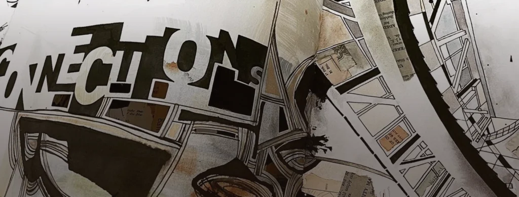
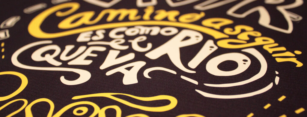
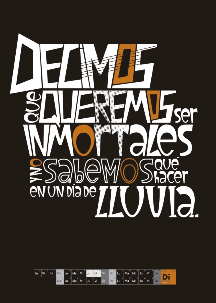
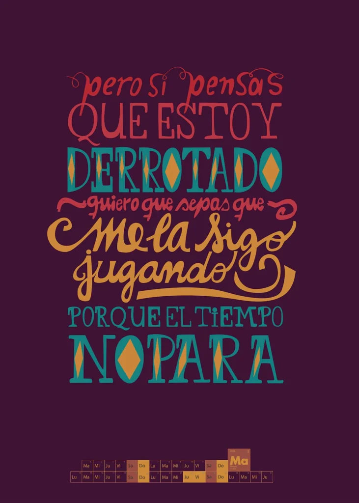
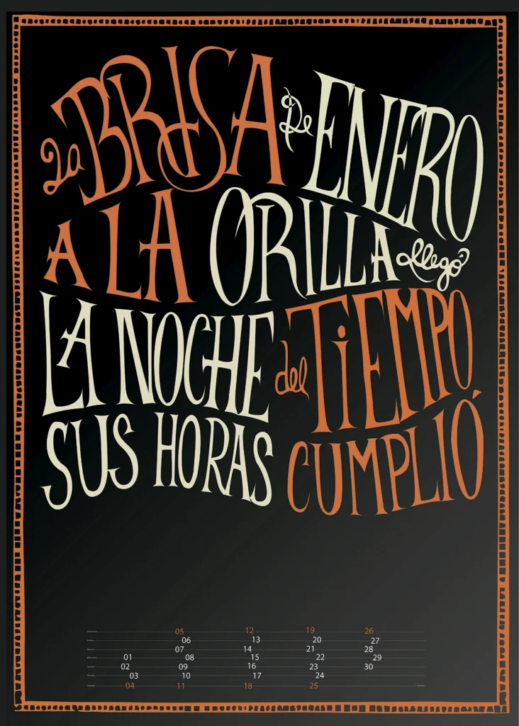
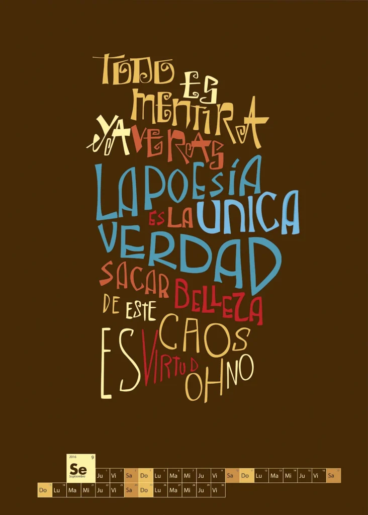
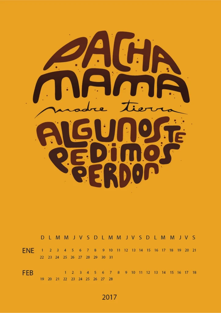
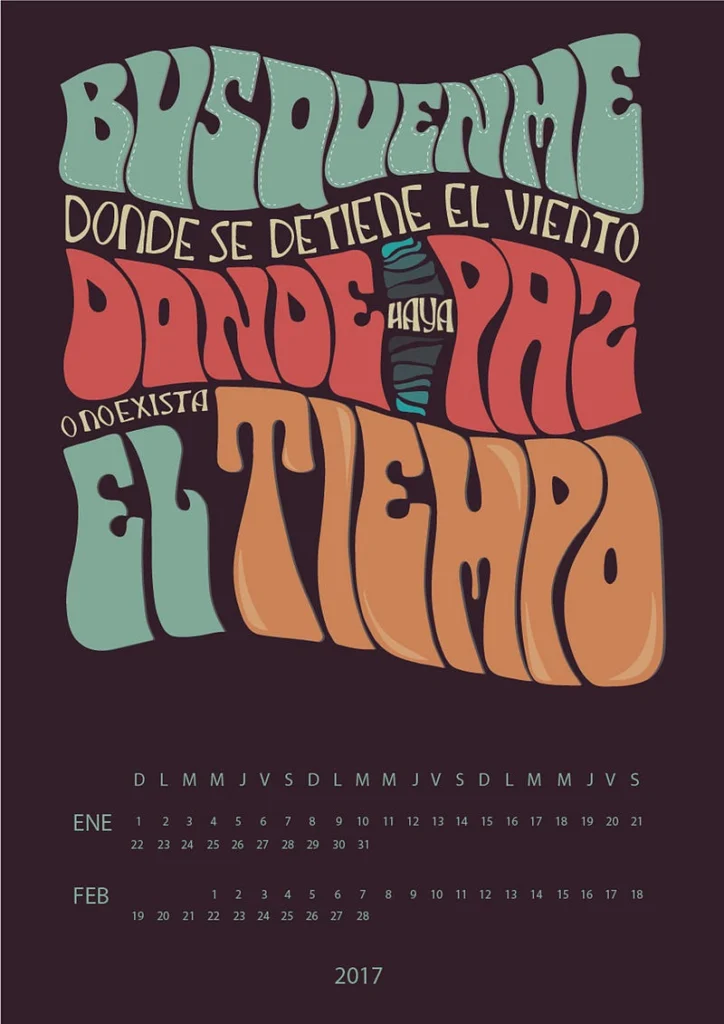
The examples that we show are inscribed in this search for this economy of resources. They are students’ works and in each of them it is proposed to make a synthesis between personal expressive gesture and previous knowledge about handwriting and typography. These works also aim to revalue some social practices relegated to being considered popular or marginal to the official knowledge of typography.
But… what is drawn letter?
We call this approach “drawn letter” because we try to make it have a very comprehensive meaning, as the students use compositionally forms that are not typographic (they are not standardized forms and do not belong to any type family). Nor are they scriptural forms, they are not traced. They are shapes drawn in the sense that Gerrit Noordzij defines lettering. That is to say, they are compound shapes, more flexible than calligraphic forms and they allow retouching strokes. Students begin by drawing signs taking into account the structure of each letter and the whole composition.
Once the compositional structure has been defined, the works can incorporate other alphabetical forms such as those coming from the so-called illustrated letter, from urban and advertising graphics, from Buenos Aires filet, from lettering, from graffiti or from pop art.
BIBLIOGRAPHIC REFERENCES
Abbott Miller, J, Lupton, E. et al. (1992) Printed letters : the natural history of typography. Jersey, EU: Jersey City Museum.
Last, Jay T. (2005) The Color Explosion: Nineteenth Century American Lithography. Santa Ana, EU: Hillcrest Press.
Massin, R. (1970) La lettre et l’image. In: Communication et langages, n°6, 1970. pp. 42-53. www.persee.fr/doc/colan_0336-1500_1970_num_6_1_3800
Moles, Abraham & Costa, J. (1999) Publicidad y Diseño, Buenos Aires, Argentina: Ediciones Infinito.
The Modern Poster. The Museum of Modern Art. 1988